Nivon Magazine Cover
Hello Dribble! This is my first post on this platform and I am happy to be part of it now. I would like to share a magazine cover that I recently made for Nivon. I'm curious about your reactions. Here is an explanation of the project.
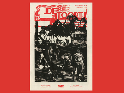
Nivon approached me to design the cover of their magazine De Toorts (The Torch). The magazine has been in existence for 95 years and has its origins in a workers’ movement. So my challenge was to make it look like it was from the 30’s.
I started collecting information about Nivon through conversations with my contact. Based on that information, I created a very accurate image archive that I could use as reference material.
I started drawing from that archive. The situations I drew I could immediately link back to activities that Nivon organizes.
It was a challenge because I had to make sure it had the feel of 1930s wood carvings. I started with pencil and after digitizing everything I printed it on old paper and added new lines. Lines that are almost identical to the lines of wood carvings.
Client: Nivon
Art Direction: Bob Mollema
