Daily UI #003
Day 3 of the Daily UI Challenge.
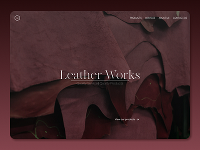
For this challenge, I wanted to focus on visual hierarchy. Specifically, as it concerns the text on the page.
Since the company/website name gives context to the page; I made sure to give it primary visual importance by increasing its size and differentiating its font.
The "view products" link is given a subtle call to action (and thus secondary importance) by having its font-weight be heavier than the text for the navigation names.
The navigation names are given tertiary importance by having an all caps text style.
