Branding: Logo design
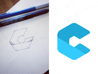
Here's another letter coming from the same shape :) I decided to go all flat since you guys seemed to like it better as well. Cleaner and feels fresher.
I attached different treatment versions. I thought you might like to see the different ones I did as well.
Do you guys have an idea what is it gonna be for?
More by Mixpanel View profile
Like


