Daily UI #002
Day 2 of the Daily UI Challenge.
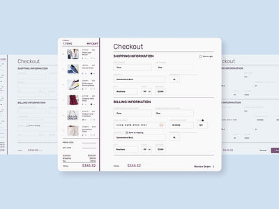
With this design, I tried to focus on reducing visual and motor load during checkout.
The visual load was reduced by making important information stand out and easy to read (total amount, checkout section headings, and purchase button). It was also reduced by not emphasizing less important information (information titles like first name; address; etc).
The motor load was reduced by having everything accessible on the same page (able to view cart items and check out at the same time and also able to edit cart items without going to a different page).
