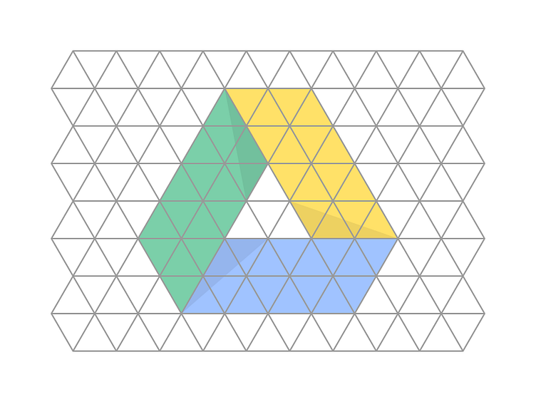
Google Drive icon structure
The Google Drive icon structure, on a grid that explains it's construction.
- - -
We designed Google Drive's product icon at Upperquad (@UPPERQUAD) in collaboration with our super friends at Strohl (@strohlsf). I got the fun task of fine-tuning (a.k.a. "cleaning") the selected concept so that we could have an extremely simple shape. I also made several illustrations for this project back then. Will hopefully collect and post them soon. - - -
We didn't use this grid during that process. But I am doing this "breakdown" now to show the logic behind the structure we arrived at, to be used on a case study.
I was about to add the angles and some indications on the corners of the shapes that make the shadows... But I guess it is straightforward enough, right?
This was a fun one to work on. Thanks for checking it out.
