DEFINITELY
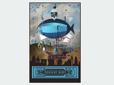
I took a stab at creating my own podcast cover but would love something more professional and clean looking (see attached podcast cover image); I'm limited in my ideas and what I can do on my own (so please don't limit your idea to copying this one). I like modern, sans serif fonts and like the idea of leaving some one's to demonstrate the idea of unlearning (but I'm DEFINITELY open to suggestion so again...give me what you've got). As the other images suggest, I like colorful (particularly the splotchy paint look) BUT clean (I dislike busy). I want to emphasize learning, growth and creativity without looking tacky or immature. I also do not want it to be too technical; I'm going for an approachable and conversational vibe with my poster and look.
