iOS 7 - Settings

As a follow up to my previous shot detailing some ideas I had for improving the iOS 7 UI aesthetics, I decided to explore (among other things) nav bars and table views in this new style.
A major contradiction I see in iOS 7's design is that the relative 'weightlessness' of the visual design clashes with the enhanced physics and motion seen in the UI. It seems there was an attempt made to remove all 'superfluous' ornamentation details (borders, shadows, etching,...) However, if all of the elements on my screen are meant to be purely 'digital' in appearance/interaction, why do they interact with a gravity source and display characteristics such as mass, weight and friction? That's one of the primary arguments I see in favor of adding some dimension back into the visual style, and I think that can be accomplished while still placing greater emphasis on a clean, open and airy aesthetic.
Some notes:
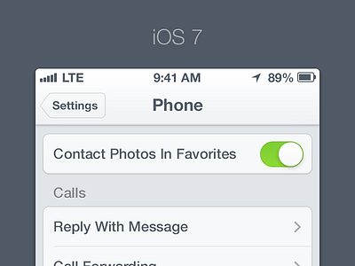
- Once again, I think the nav bar and status bar being unified was a superb idea, and resolves the issue of the status bar style often conflicting with the current app UI (or even the color of the device). However, I don't believe the choice to remove bar button borders entirely was correct- they can still be subdued in style, but provide an extra bit of reinforcement as to what is tappable and precisely where it's tappable.
- The lightening of the table view style I think was a great idea as well- it's more similar to the iPad's table views, and is cleaner and more modern with the muted colors and lack of pinstripes. But again, I think they went a bit too far in removing all visual flourishes- I attempted to make the row groupings more clearly delineated with some subtle bevels and shadows, as well as reverting back to the clipped width style, as opposed to the edge-to-edge style of the new ones.
- I think Apple was right in deciding now was an acceptable time to finally remove the somewhat clunky 'ON/OFF' labels from the toggle switches. The only modifications I made to them were to add some very minor edge/bevel effects, and I also modified the green filled state to match the excellent color scheme offered by @Louie Mantia (http://dribbble.com/shots/1118715-Colors)
And that's about it. As always, ideas, comments, criticism?