VAYA wordmark refresh
We didn't create the original, but we recently had the opportunity to refresh the VAYA Adventures wordmark.
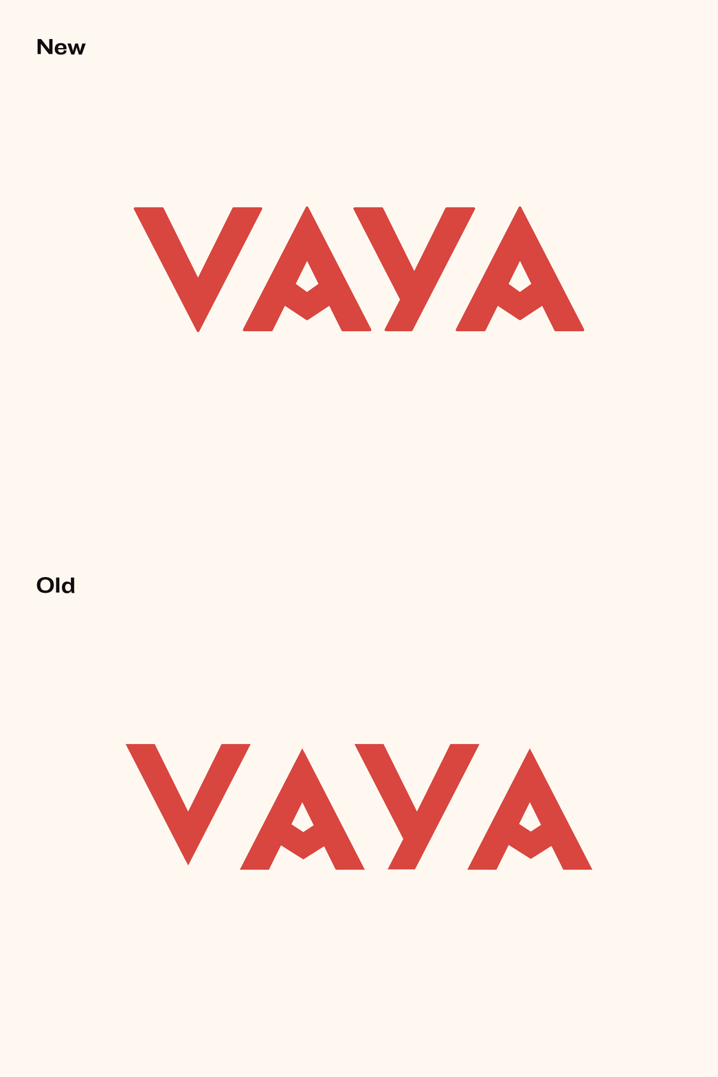
Updates include tighter kerning, subtle rounded corners and correctly realigning the letters on the baseline to create optical balance.
Check out the GIF on the next slide to see how these small updates made a big difference.
More by 829 Studios View profile
Like


