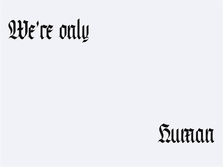
Frakkarantine - Typeface


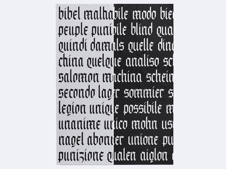


While I was hoping to have a first set of capitals to show you today, reworking the existing took me much longer than I thought. The first major change lies in the width of the letters; when I considered consistency, I realized I wasn't in the right place as of yesterday. Some letters also felt a bit "unstable", which I believe I fixed.
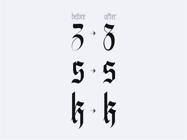
Drawing the 'z' was particularly challenging. 'Do I go for something round and organic as it should be, or do I keep it sharp and pointy?' I found an answer right in the middle, with a pointy top component that's the same for many other letters while drawing a new loop for the bottom part.
I also fixed the 's', which didn't feel like belonging to the same typeface, somehow.
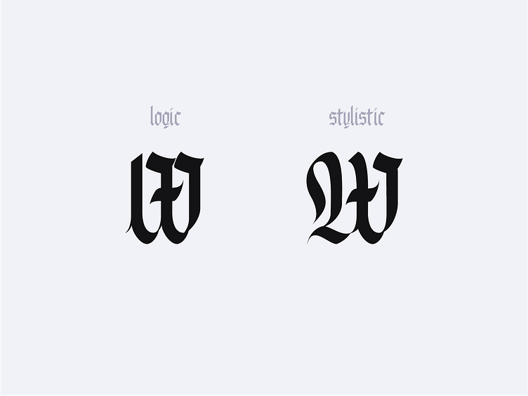
The last fix here is the 'k'. Many of you told me they really liked it, and I appreciate that. But I also felt like it wasn't as good as it could've been, nor really consistent with the rest (that spiky bit was overdone). Slide 3 shows a glimpse of the upper case. The last one explains the rationale behind it.
Ps: Pls don't judge my kerning.
While I was hoping to have a first set of capitals to show you today, reworking the existing took me much longer than I thought. The first major change lies in the width of the letters; when I considered consistency, I realized I wasn't in the right place as of yesterday. Some letters also felt a bit "unstable", which I believe I fixed.
Drawing the 'z' was particularly challenging. 'Do I go for something round and organic as it should be, or do I keep it sharp and pointy?' I found an answer right in the middle, with a pointy top component that's the same for many other letters while drawing a new loop for the bottom part.
I also fixed the 's', which didn't feel like belonging to the same typeface, somehow.
The last fix here is the 'k'. Many of you told me they really liked it, and I appreciate that. But I also felt like it wasn't as good as it could've been, nor really consistent with the rest (that spiky bit was overdone). Slide 3 shows a glimpse of the upper case. The last one explains the rationale behind it.
Ps: Pls don't judge my kerning.