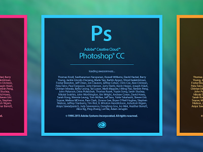
Adobe Creative Cloud Splashscreen
Hello Adobe,
I love the new features, but I hate your new splashscreens:
http://d.pr/i/K8Xe
InDesigns, for example, has way to dark colors and the CC Artwork doesn't fit perfectly. Can we keep it simple?
More by Clemens Posch ∞ View profile
Like
