Zoe Robinson Logo Design

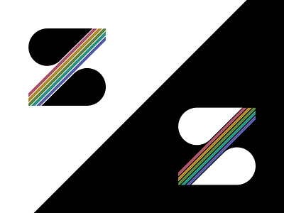
I designed this logo for my personal brand, with a goal of abstract minimalism. The final design uses different Gestalt principles, especially repetition and proximity of shapes to form the ‘z’. Continuity is also used in the stem of the ‘z’, and adds some dynamic movement to the logo.
The colors and shapes work together to give it a slightly retro feel, which contrasts the modern typeface used in my portfolio. The colors are all accessible, as determined by WCAG AA standard for large text.
What are your thoughts?