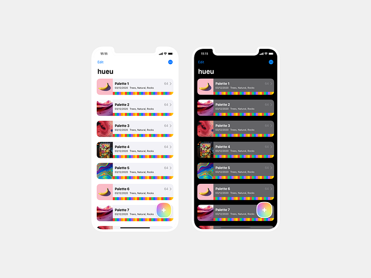
hueu iOS light and dark
So, this project originally started off as a macOS app...
Started.
In the process of better familiarizing myself with HIG design standards, I went through the Apple SwiftUI tutorials. The goal was to understand how some of the views are actually built. I also wanted to learn about their possible limitations so I don't piss off my dev counterparts with headache inducing, shiny designs.
Naturally, I got carried away and built an iteration of the design using what I learned... in Xcode.
So now hueu is definitely going to be an iOS app earlier than expected.
Gotta say, SwiftUI is wildly addictive!
I'd add a fullscreen shot but these are screens from the simulator (complete with zebra gum colors and FPO text) so if you want dat crispness you'll just have to download the app once it's done: https://hueu.app
(oh and the lil‘ demo photos used are by Peter Secan, Scott Webb, Edgar Castrejon, Adrien Converse, Mike Dorner, and Daniel Olah on Unsplash)
