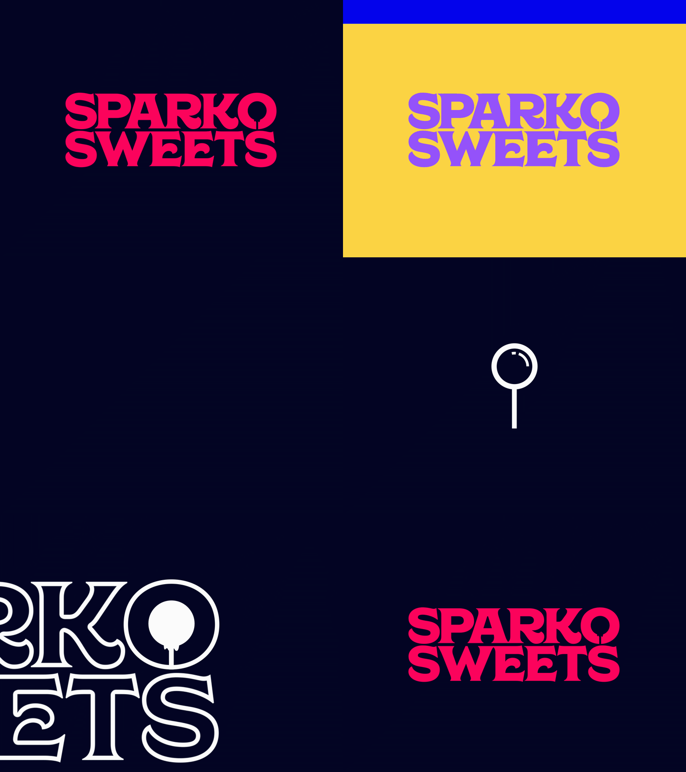
Sparko Sweets Logo Rebrand
The Galaxy Pop is the brands’ most iconic product and exists in its original typographic logo identity. Balancing its proportions and construction of its letterforms, we fit the lollipop perfectly onto the counter of the O, to which in itself, represents the shape of the lollipop, preserving its quirkinesses but making it modern. The letters align with the number of characters in its name, complimenting the striking visual balance and bold anatomy of the typeface. The update enhances this logo to its key elements by refining the typographic forms.
To learn more about the project, visit trishatan.com . #brandidentity #identitydesign #branding #logo #cpg #packagingdesign #graphicdesign #designspiration #designinspo #sparklovejoywonder #sparko #candy #confectionerydesign #lollipop #candypackaging #sweets #galaxypop @sparkosweets
