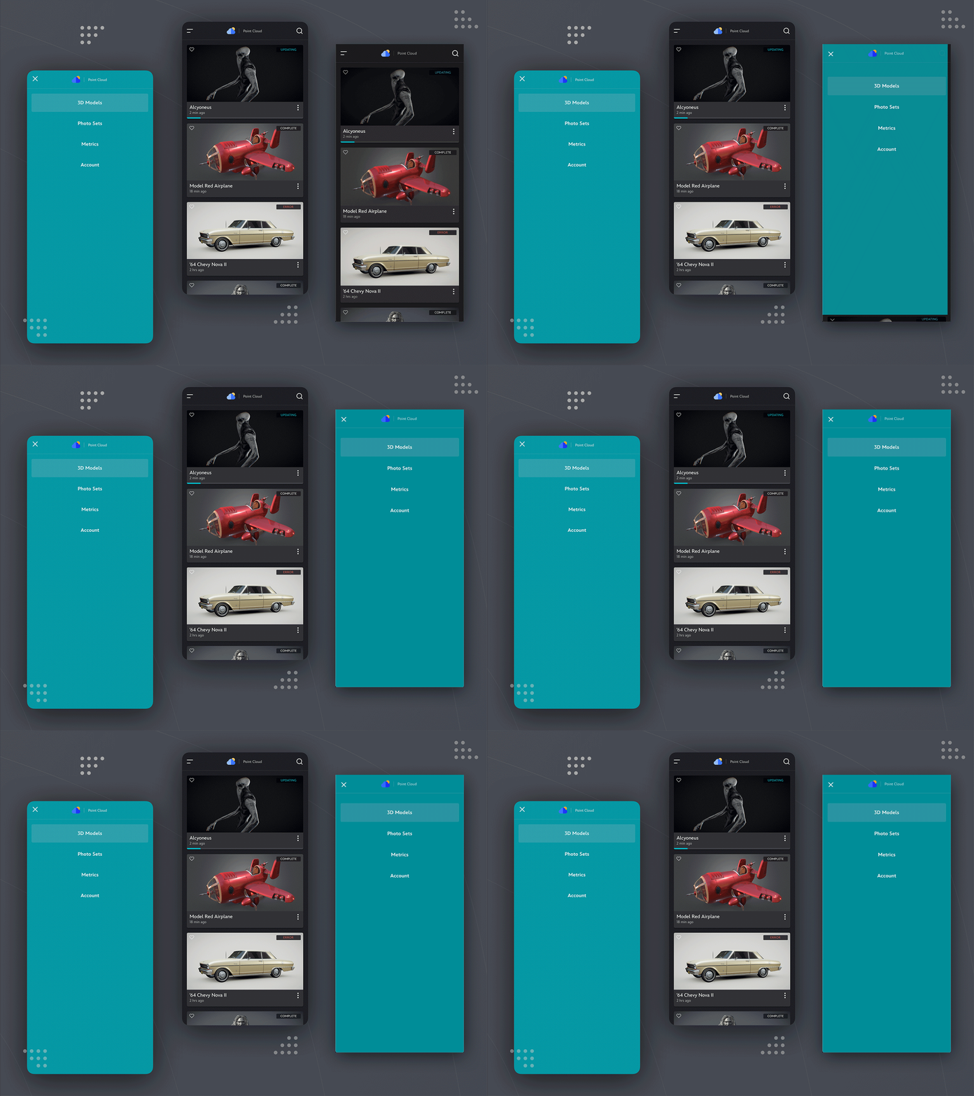
3D Model Mobile Menu
I love page transitions that feel as organic as possible while also helping the user shift their mental model to the new workspace. In this example, the user is moving from browsing through a list of options and then selecting to jump to a different part of the app. Using a completely different background color helps the user understand that this space is unique from all of the other dark theme pages which helps establish that this page is a unique area of the app.
This app was designed and prototyped in Framer X.


