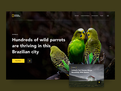
National Geographic Website Redesign
The world’s beauty is endless. Wherever you go, you’ll find it everywhere. This is exactly what we wanted to say while trying to recreate the National Geographic website’s design.
Don’t lose touch with the world of nature and
Check what we’ve come up with
A few considerations:
🌎 When it comes to app design, UX is the main priority. Although, making the product aesthetically pleasing also matters.
🌳 To make UI feel more natural and increase environmental perception, we opted for green-colored wildlife background images.
While getting things almost done we thought, “Well...exploring THE NATURAL WORLD through AN APP”
Does it sound contradictory?
Say what you think below!
More by Ilya Sablin View profile
Like
