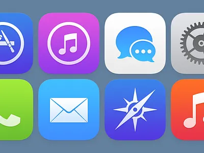
iOS Icons (Version 2)
Almost a year ago, I took a day or two to redraw the iOS icons.
Since then, Apple's introduced iOS 7, with a visual style that is fascinating and new. The talented people at Apple have worked really hard to create something pretty cool for us.
Today, I revisited that original task and took about a day to understand the new style. Simpler, smoother, subtler. While I don't employ the grid they created (and while I instead use the colors I chose), these feel interesting and balanced. Vibrant and bold, but not overbearing.
These aren't necessarily a suggestion and certainly aren't a demand. I leave it in the very capable (collective) hands of those talented people at Apple to figure out what's best. But being who I am, an icon designer, I took it upon myself to do something on my own.
"Once you free your mind about a concept of harmony and music being correct, you can do whatever you want." – Giorgio Moroder

