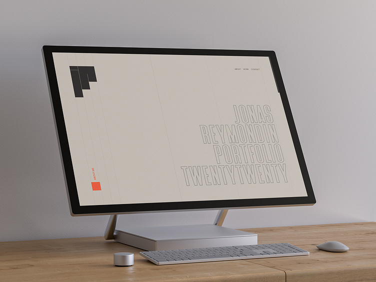
Portfolio 2020 – design
The design of my twenty twenty portfolio took a long time to reach its final version. I wanted to show a Scandinavian style and earthy hues, except for one color that stands out.
Following the direction taken on the logo, I structured the site as a whole and I used square shapes in different places to link the logo to this minimalist design.
➡️ https://v3.jonasreymondin.com
©Mockup: https://www.anthonyboyd.graphics
More by Jonas Reymondin View profile
Like
