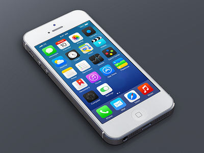
iOS7 Redesign - Again
I know there are a lot of different takes floating around out there. I received a lot of great feedback on my first stab at redoing the iOS7 home screen: http://dribbble.com/shots/1111180-iOS7-Redesign ... however, I agree with a lot of the feedback that I deviated too much from the intended direction.
So I took another stab at iOS7, and I'm pleased to share with the dribbble community what I came up with. I think this usage of color, space, iconography and typography is a simple, cleaner and more effective solution for iOS7's home screen. Hope you all enjoy!
2x, HDPI attached, as well as larger render. Cheers!
More by Michael Boswell View profile
Like


