Logo design for Ds Trumbull Photography
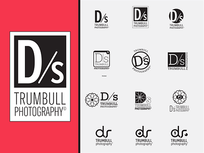
A client wanted a new logo for their photography business, that didn't resemble a "typical" photography logo (i.e. no cameras). They wanted a logo that could easily work as a watermark and could also have multiple style's applied to all OR parts of it (such as different colors, transparency, texture, etc.). The only requirements were that the "D" be capitalized, the "S" be lowercase and to include a divider of some sort. The four categories I offered were: Dom/sub typography; Geometric enclosure; Mandala lens (based on his own tattoos); and Abstract handles.
My client felt that the strength of the "Dom/sub" typography mixed with the negative space, would allow him the most flexibility with his identity, while still being a strong mark.
