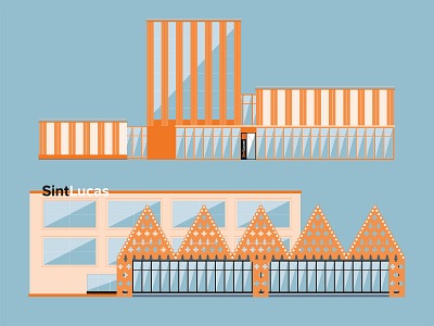
SintLucas | Restyle | Visual Design
Back with some SintLucas work! But this time, somewhere around 2017 they asked for a new style! We went for something less cartoony than the previous style (see project folder). Thin lines, sleek shapes and the addition of a first-person view made this style easy to use for explainer videos.
The concept visual was black with orange shapes but the client wished for a less heavy look, so we used blue.
Let me know what you think about it!
More by Luke Looijen | Anglure View profile
Like


