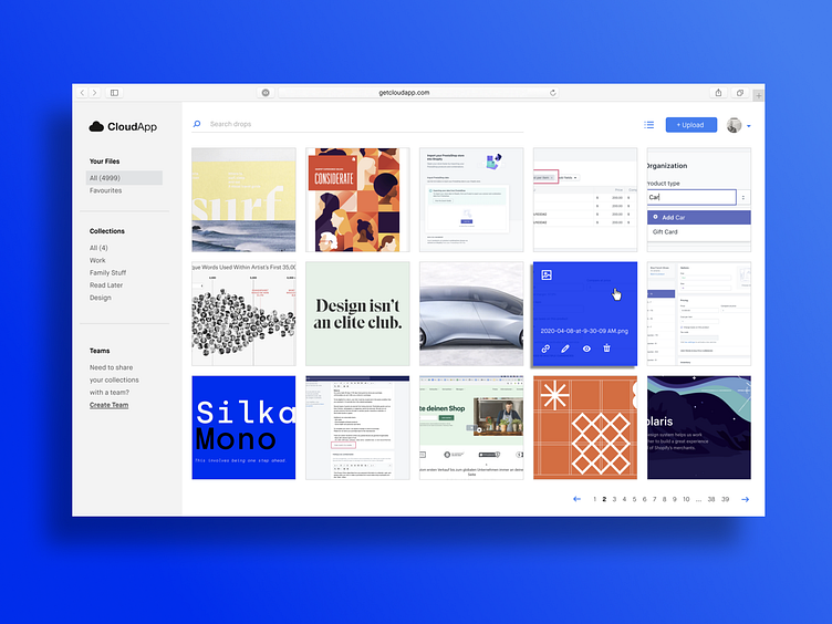
CloudApp Re-design
I've been a CloudApp user for more than 10 years, and I've primarily used it as a menubar extension. Recently I went to the dashboard to find an old screenshot and was asked to view the "new UI". Given how awesome this tool has been, I was excited! But when I landed there I was really surprised. It felt heavy, confusing and lacked the polish I was expecting, so for fun I did a quick re-design. I mainly focused on cleaning up the IA, improved the visual hierarchy and adjusted the typography so that the screenshots were the stars of the show, not the other way around. Feedback welcomed!
More by Matt Hryhorsky View profile
Like
