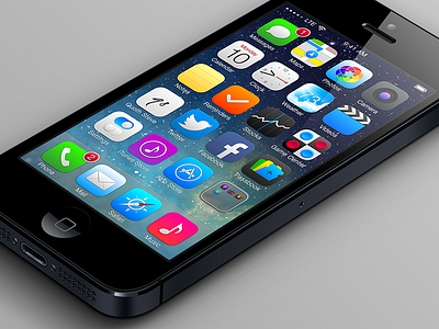
iOS 7 Refinements - Home
iOS 7 REFINEMENTS
WWDC has come and gone, and everyone has formed an opinion on what they like and dislike. I'm no different. And although much of how I feel has already been written in one place or another, I just couldn't help myself. There were a few questions, observations, and suggestions I just had to get down.
Before I jump in, yes, I realize we're talking about software in beta. It's buggy and it's likely to change before going gold master. But that's precisely why I wanted to publish my ramblings … on the slim chance that others agree with my views, and the even slimmer chance that some of those are in a position to affect change in iOS.
I'm a big fan of Apple and their products. And I have great respect for their team of designers and developers. For anyone outside that circle, myself included, to butt in and suggest improvements takes real gall. What do I know about the future roadmap of iOS or the many hidden reasons they're doing what they're doing? That said, everyone's entitled to an opinion. With that, let's continue.
APP ICONS
Many people feel that the new app icons introduced in iOS 7 are a step (or two or three) backward. They just seem to lack the quality and attention to detail that we're so used to from Apple. As many have done before me, I spent a few hours crafting what I'd want to see on my home screen every day for the next few years.
UI SUGGESTIONS
• Bring back the subtly rounded corners on the edges of the screen. I believe this detail shows an attention to detail and matches the rounded edges of iPhone and iPad screens themselves. Maybe these squared off corners are intentional? Maybe future iPhones will have edge-to-edge screens and we won't want barely-noticeable rounded corners? But for now, I want my rounded corners back please.
• Don't kill off shadows and bevels completely. I'm 100% on board with the toning down of excessive glossiness and unnecessary skeuomorphism. But shadows and bevels are great tools for defining edges, for adding subtle dimensionality, and for highlighting areas of importance. Should we strive to be minimal? Absolutely. But not at the expense of clarity.
• 1 pixel width lines just don't look good, even on a retina screen. The battery icon in the top right looks muddy. Those lines are too close together.
• And while this critique is focused on the home screen, I have to mention the new back buttons: yuck. They're too big and they take up too much horizontal space that could otherwise be used for the view title / more controls. I've always been on the fence about whether hinting where you were / where the back button will take you is valuable enough to eat up a lot of UI space anyway.
FOLDERS
As I mentioned before, I think it's great that paging has been added to folders so we can now encapsulate more than twelve apps at a time. Goodbye utilities folders 1, 2 and 3! But I'm pretty unhappy with the visual design of the folders. When collapsed, it's hard to distinguish a folder from a regular app icon. And when expanded, the folder background feels bland.
NOTIFICATION & CONTROL CENTER
The Notification Center and Control Center panels could use some work. I may try a quick mockup to illustrate some changes I'd like to see in the future, but for now I'll only ask this question: Why do they overlay the screen in different ways? One darkens the screen, the other lightens it.
CONCLUSION
People are averse to change. I acknowledge that a lot of what bothers me now may seem totally acceptable to me after a little more time. But I do think there are some design refinements that could be made that would address the concerns of myself and others. I'd love some feedback on the thoughts and mockups. Thanks!

