Wasteupso - Logo and Branding Makeover


Wasteupso is a Korean home accessories and healthy foods company with an aim for zero-waste living.
In our initial meeting, they said they wanted their image to be warm, organic and modern. They wanted to be "more of a lifestyle than a brand".
But that's not what their original branding was saying. Prior to our meeting, I actually thought they were a recycling company. That's what their logo said, anyway.
Version 2 came from the original design brief. It's better, but still not "lifestyle".
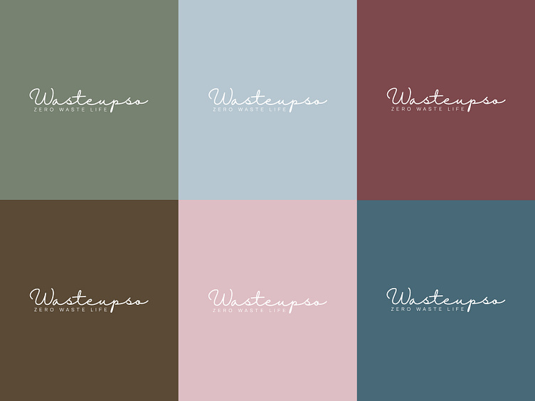
The final version came very late. I was frustrated by the lack of progress, so I just started stream-of-consciousness designing. This look, along with the slogan, was the very last design of the night. The client came by the next day and was immediately drawn to it. They've subsequently used my branding to completely overhaul their company's image.
Fonts: Halimun and Armin Grotesk Thin
Wasteupso is a Korean home accessories and healthy foods company with an aim for zero-waste living.
In our initial meeting, they said they wanted their image to be warm, organic and modern. They wanted to be "more of a lifestyle than a brand".
But that's not what their original branding was saying. Prior to our meeting, I actually thought they were a recycling company. That's what their logo said, anyway.
Version 2 came from the original design brief. It's better, but still not "lifestyle".
The final version came very late. I was frustrated by the lack of progress, so I just started stream-of-consciousness designing. This look, along with the slogan, was the very last design of the night. The client came by the next day and was immediately drawn to it. They've subsequently used my branding to completely overhaul their company's image.
Fonts: Halimun and Armin Grotesk Thin