Payment Screen
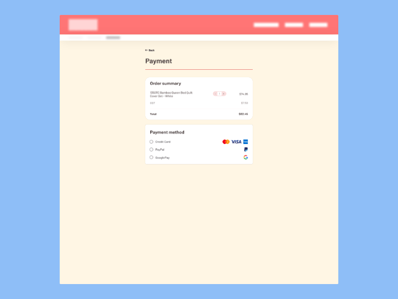
A payments form I designed for the #DailyUI challenge I've started.
I've tried to create an interface that's simple but achieves a lot.
I chose to use an expanding card pattern because it allowed combining both the Order Summary and Payment Method steps in one screen, without information overload.
Before arriving at this design I also experimented with a drop-down and a tab pattern for Payment Method, but chose radio buttons for their simplicity and scannability.
