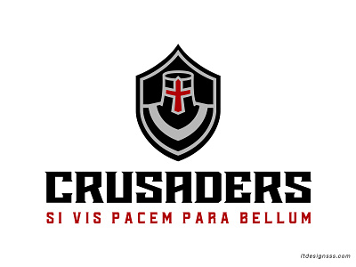
Crusaders Identity Lockup
Crusaders Identity Lockup.
.
Well after all that I decide to make the secondary mark the logo itself. Base on this I developed the other marks as well.
.
The overall look I wanted to have a sharp vibe and a minimalist approach. That's why the crusader is build within the negative space of the shield.
.
Regarding typography I went with a sharp serif based font created from the actual cross itself , with tiny adjustments on the weights.
.
Hope you guys enjoy it!
.
For custom projects Contact me Here
or send me a line at ltdeignsss@gmail.com
.
If you wish to stay connected follow me on any of the social medias attached bellow. :)
More by Lia Tanasa View profile
Like


