Alkhadima Cosmetics | Brand Identity
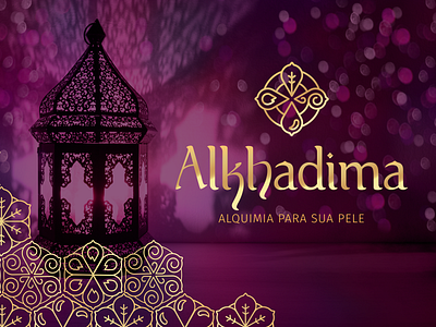
Alkhadima is a skincare cosmetics company that uses the relationship between elements of nature inherited from the wisdom of alchemists to offer the best products for your skin type and help people to redefine happiness through a sense of personal well-being.
According to Alchemy, all existence comes down to four elemental archetypes: Fire, Earth, Air and Water. The possibilities of combining the four elements determined the nature of all things, both physical and metaphysical, including human nature.
The Alkhadima symbol brings together the four elements, inserting them in a circle, indicating their cyclical interaction and referring to the alchemical formulas, which were also based on these circles. The Arab heritage was brought through the typography, in an exclusive design which uses its peculiar calligraphic writing and the shape of its architectural constructions to create a typography with personality and style.
There's much more to this project, if you are curious, you could grace me visiting the full project disclosure at Behance.
https://www.behance.net/gallery/96015385/Brand-Identity-Alkhadima-Cosmticos
Thank you very much! :)
