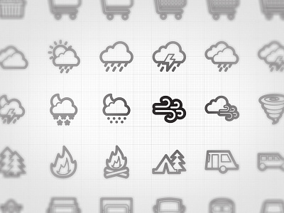
which one?
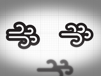
Gone back to improve this wind icon.....took @Axel Herrmann advice and looked to make it with fewer elements. I have combined the wind gusts more to have less black and make it feel lighter.
Original on the left, Newer one on the right.
Let me know what you all think is the best one