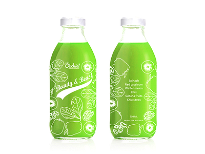
Beauty&Beast
Smoothie Beauty&Beast from the Australian start up.
We were called to design packaging for smoothies with natural ingredients incorporating aesthetic of retro milk bottles.
Retro style is emphasised both the shape of the bottle and the font of product’s name. We made the bottle transparent to strengthen messages about freshness, purity and the high quality of the product.
Placing pictures of the ingredients strategically around the contour of the bottle helps to educate the consumer about the benefits of the product. Keeping packaging design minimal, yet elegant and sophisticated is key to putting product first.
More by Anastasia Smyslova View profile
Like
