MYKI Website
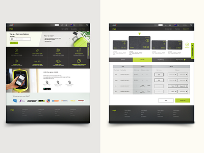
A while ago, my Myki card was running out of money right before leaving work and, having some extra time, I went to their website to top up. WOW – the website looked exactly like how it did in 2013, which was how long ago it had been since the last time I’d visited. So, during my down time at work, I decided to re-design the Myki homepage.
First thing I did, was search if there were any concept design online, and found there were actually quite a few amazing concept designs for the app, but not a lot for their website.
Why desktop version?
I always keep in mind that “mobile first design” is important and I wasn’t sure if it was worthy to re-design the Myki website desktop version. So I did some research and asked others about their experience with the website. I was surprised how engaged everyone was when talking about the Myki website and decided to tackle the problems they raised.
For the rest of the story and the design process, please go
https://www.kiandra.com.au/blog/A-Redesign-for-the-Myki-Website-2
