Audacity logo proposal - usage
The current Audacity logo is really recognizable. It has been what it is for so many years it's not a wise idea to totally reshape it into another design.
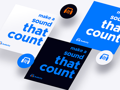
My goal was to stick as much as I can to the old logo idea and redesign it so it catches up with modern graphic design standards.
My logo proposal is flat, brighter than the current one. I wanted to remake headphones shape and utilize a waveform in a minimal, easy to read style. Brighter colors indicate that its the interface is simple and user-friendly.
