Is this an improvement?
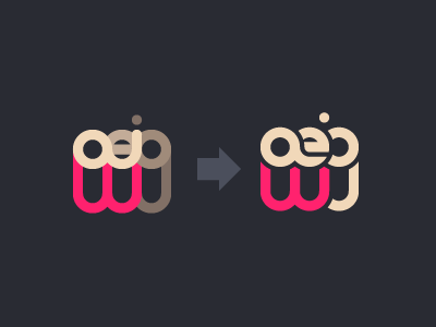
I was a little uneasy with a logo that relied on color relationship so heavily. With this change I feel like it's cleaner and can be seen in b&w (monotone).
I was a little uneasy with a logo that relied on color relationship so heavily. With this change I feel like it's cleaner and can be seen in b&w (monotone).
