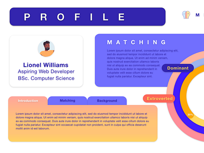
UI for Mentoring Website
I wanted to make a more playful and fun interface to make people excited to use our mentoring application. I stuck to variations of primary colors to give a primary education vibe, and used gradients and rounded boxes to give it a sleek and clean contrast to the color palette.
More by Sneha Ravichandran View profile
Like


