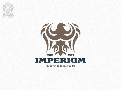
IMPERIUM Logo
One of my favorite styles is heraldry.
But not in the old form, but in a more modern one.
Logos of this style look very status and solid.
The modern style of the heraldic logo gets rid of small details. Forms are getting easier. This makes it possible for the company to put a logo on any surface without graphic loss, which is very important.
The logo does not lose its detail at small scales.
The correct arrangement of colors in the logo draws your attention to two important details. This is an eagle (it is the main element of the logo) and the name.
The font style of the logo is not chosen randomly. It harmoniously fits into the overall look. Its form gives you the feeling of something ancient, historical and majestic.
More by Dmitriy Dzendo View profile
Like
