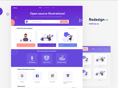
UnDraw Redesign - Ux case study
I really like undraw illustrations, i always download undraw illustration. but some frustrations happens, while downloading, if i want to download my desired illustration, but takes 5 clicks to download the illustrations. no clear value preposition, hard to find the search box. no clear testimonials. that's why i decided to redesign the undraw website
Full case study on behance - https://bit.ly/3bAXBFI
After redesign ......
1. Clear value preposition
2. Clear search option
3. You Change the illustration colour in download page
4. Zero Interaction cost
5. Saves energy of the user, easy to perceive
The information and interact with
6. Make people have trust in website because placing
the section Like testimonials and used by giant
companies
