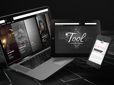
New Tool Website
Although it has been online for a few weeks now, I am very happy to officially announce the new Tool of North America website.
This was a massive undertaking, probably the biggest and most challenging site I have ever worked on.
The site is built upon its own custom framework, it showcases 200+ award winning live action and digital projects, 20 individual director profiles, and it utilizes a good amount of what CSS 3D and HTML 5 has to offer.
It took many months of late nights, long meetings, countless rounds of approvals, maintaining the balance of good design and Tool's business needs, starting development over a few times, debugging mobile and archived browsers, and cutting together a new reel of all of the amazing work Tool does.
Our dev team is super talented and one of the biggest reasons I am free to dream anything up and it actually make it to a real website and not just a concept piece.
My roles were creative direction, UI, UX, desktop & mobile designs, some CSS responsive code, co-direction of the motion reel edit, and working with Alex Goose to produce the perfect music track...which Alex nailed very quickly.
Check it out on your desktop, then check it out on your mobile devices.

