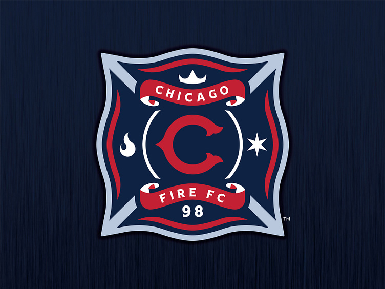
Chicago Fire FC - Logo Concept

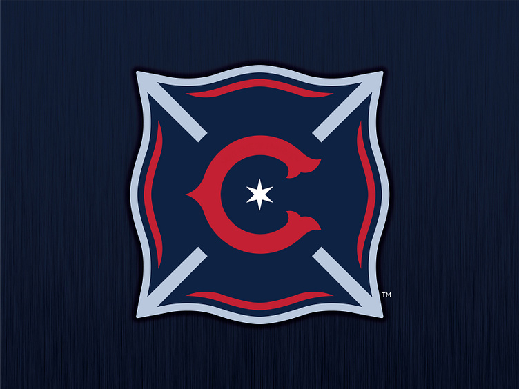
Chicago Fire FC - Logo Concept
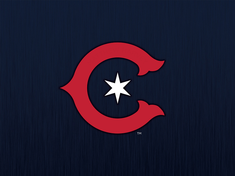
Chicago. 1998 the Fire took the field for the first time.
This past year, the Fire unveiled the team's first rebrand. While there has been a lot of backlash, I am one whom actually doesn't mind the new branding. It took some time to get use too, there are some nice elements with their new badge.
One thing I wanted to try was rebranding the logo with similarities from their first logo.
This new concept has a lot of symbolism of Chicago; symbols, iconography, typography, a badge that the fans can connect with.
This is a badge full of pride. A badge full of history. A badge for Champions.
Enjoy!