Camomila Logo
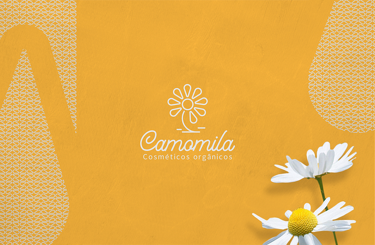
This project was developed with great love for an organic cosmetics brand that is starting its work. The name was chosen by the client, as something that reminds her of peace and calm. The yellow and white colors represent the chamomile flower, its softness and uniqueness! The brand was born from the idea of bringing more simplicity to people's daily lives, thinking about the health and well-being of those who will use their products, showing that they don't need much to take care of ourselves and the environment!