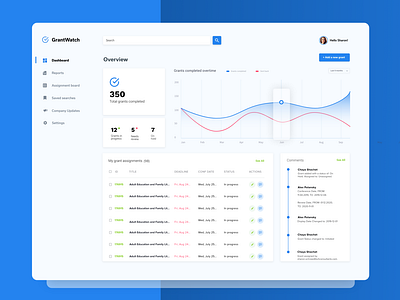
GrantWatch Dashboard - Blue
Another version of the GrantWatch Dashboard.
This time in blue, which I do love but what do you think???
The goal with this dashboard was once again actionable insights.
We've all seen those dashboards full of stats that have no real purpose. Data displayed just because it can be, not because it's actually useful to marketers or the employees of an organization.
Here, I wanted to show clearly in the hierarchy the tasks for the grant researchers, editors, and proofreaders.
How many have been completed and how many are in progress, on hold, and most importantly needs review.
_____
Want to learn more about the processes behind my design work?? Follow me on Instagram - https://www.instagram.com/misaac85/
More by Miriam Isaac View profile
Like


