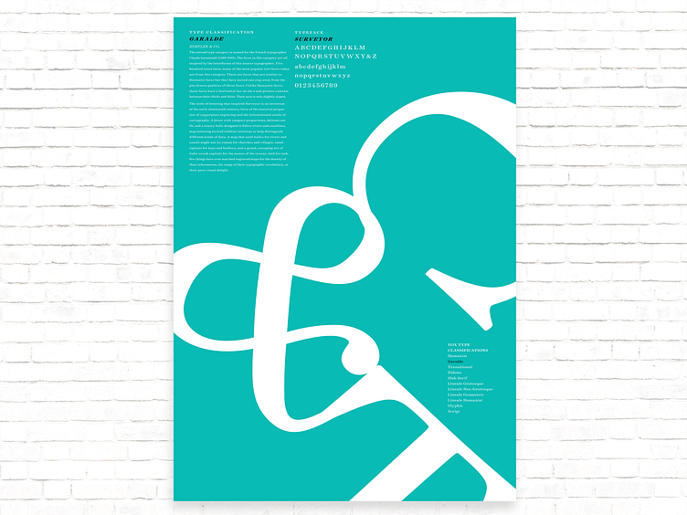
Typography Vox Classification Poster • Garalde
For this project, we were to design three typography classifications posters. The first poster is Garalde. In addition to the compositional representation, the poster include some text and a full character set of the typeface and only using one color. I used three letters from one typeface. Use a mix of uppercase and/or lowercase letters with varied glyphs to achieve an interesting composition. We were to try different crops and rotating the letters 45° or 90° angles to create an interesting and dynamic poster composition.
The font I used was from Hoefler type foundry.
Poster 1: Garalde, Typeface: Surveyor Letters: T & C
More by Nicholas Navarro View profile
Like
