Instacart UI Redesign Concept

This is a little side project I gave myself to continue practicing my UI design skills, and practice Figma, while I’m looking for a job and self-quarantined.
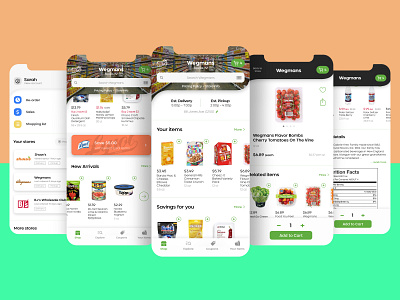
I’ve used Instacart many times and, while there are aspects of their iOS app I like, I had some ideas on what I would change. After multiple feedback rounds with various people, I’ve landed on this as my design.
I general, I wanted the interface to feel cleaner and more cohesive throughout—from general sizing and alignment to typography. One thing I decided from the beginning was I wanted this to feel like something Instacart could actually use—an evolution of the existing app’s design.
One aspect you’ll notice is the header image of each store would be customized to give the user the feeling of being ‘in that store’. Then, when you select a product, the header shrinks and goes dark to focus on the product details—mimicking your focus when looking at a product in a physical store. Also, the header’s ‘swirl’ (used on their current existing home screen only) is now utilized throughout.