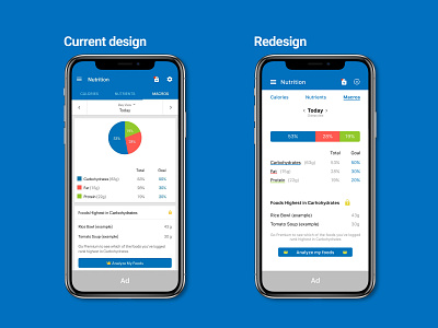
Nutrition tracker redesign
Data should be displayed in the easiest possible way to digest. AKA: No Piecharts.
In today's #DayliUIChallenge I redesigned a heavily #premium protected" screen from a nutrition tracking app.
Although this is never ideal, designers usually have to deal with constraints like space for ads and development limitations.
The two main objectives of these daily exercises are learning to deal with some of these constraints and having fun.
I genuinely enjoy doing this!
#DailyUI #041
More by José Gonçalves View profile
Like
