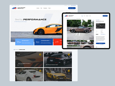
ASG site
Couple pages I designed for Auto Source Group last year.
The client was a new startup with little to no brand standards. I took a lot of my color and typography inspiration from their logo but kept the rest of the site clean and light.
The inventory page has a variety of microinteractions, card content, and filters so that dev wouldn't be left in the dark. We decided to bucket different types of inventory based on three categories (current, sold, and coming soon). This helped create a less intimidating user experience for people that wanted to browse a certain category.
The vehicle detail page was designed so that a user could easily reference info about the car while they browsed the image gallery. As the user scrolled the left side, the info on the right would stay fixed. If a section on the right was opened, both columns would scroll until the bottom of the info section was reached. All sections, on default, would be collapsed to prevent information overload.
--
Attached are the pages in their entirety
