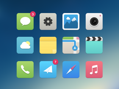
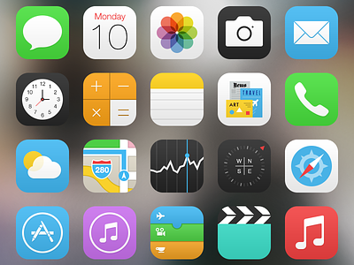
iOS7 alternative Icons
Its that time of the year, Yes I know, another redesign of the Icons of iOS 7 :)
Check real pixels here.
This is just a different approach making them smoother with less weird gradients. Although maybe these wouldn't fit perfectly with the 'whiteness' of the rest of the interface.
Check @2x and attachments for real pixels
(sorry my previous shot had some bad compression)
More by Carlos Gavina View profile
Like


