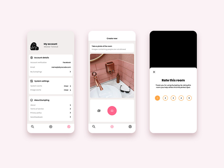
The Dumpling app
More screens from the Dumpling app. I often start with the more “boring” screens like settings and forms when I approach a new design. Something about their strict simplicity and need for clarity makes them good testing grounds for concepts and styles. No fancy images, list designs or complex cards to distract from the core of the purpose, UX, or visual looks.
More by Caroline Natthimmel View profile
Like
