City mapper UX redesign
A quick redesign of one of the screens from City mapper.
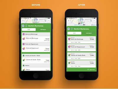
BEFORE:
In the current version, the list of lines that the station serves is quite long and consists of duplicate names (I have no idea what is the purpose of repeating the destination's name). It just makes it less clear for the user. Additionally, it adds to the scrolling, so if the user is interested in another line they have to scroll. Right now, the design with two metro lines doesn't fit one screen.
AFTER:
I removed duplicate direction names
And I labeled the time when the metro arrives. Users can see easily 2 lines. the 'now' and 'timetables' buttons are more reachable by the thumb (very important as travelers may use their phone with one hand). I also clearly labeled destination names (for tourists who may not know what those names mean).