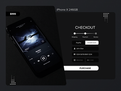
Dark Mode Checkout Concept
Hi there! Yet another shot from #dailyui - this time concept of a checkout page. The plan for that one was to make the right side looking a little bit like a credit card sticking out of the wallet on the left side. It’s been especially fun to create that one, as I have copies of my conceptual checkout pages from the past, so I’ve been able to compare my progress between those 💳
More by Wojciech Janoszek View profile
Like
