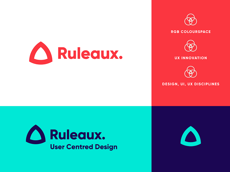
Ruleaux Brand Identity
I always knew my personal brand would be my hardest project. Needless to say I'm so happy with the results. Talking about different design disciplines is hard as you want to sell visual design just as much as UX design. I wanted to ensure the logo was a simple mark but held a lot of meaning and symbolism behind it.
The triangle is a designers best friend, it looks different when rotated, symbolises creativity and also represents my journey in the design industry. This is in fact a Reuleaux Triangle.
This simple mark represents:
RGB colour spectrum – The colourspace I build my designs in, referencing visual design.
Venn Diagram – The middle shape created on a three-circle Venn Diagram, referencing my problem solving approach and emphasis on striving for design innovation within user centred design.
Skillset – I'm classically trained as a graphic designer but I moved to UX/UI design early in my career. Within my Dribbble profile https://dribbble.com/jonny-kimber you'll see a lot of branding projects or web projects that have followed a Design Thinking approach.
My Journey – A triangle also symbolises past present and future. I wouldn't be where I am today without the work I've created, but I still have many more years to go delivering amazing design work.
Thanks for your time guys.
