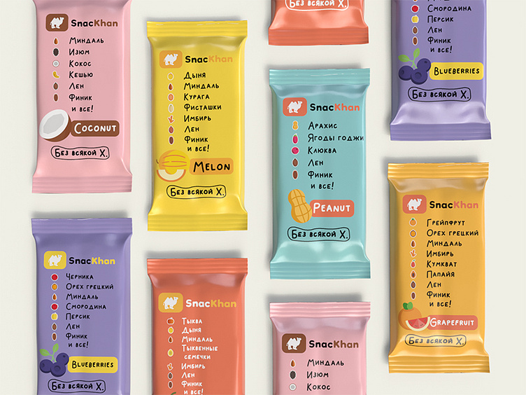
SnacKhan | Package design, logo design
SnacKhan - natural snack bar.
The task was to make a bright packaging while adhering to minimalism, as well as to create a thematic logo. The main concept is to show the entire composition of the product on the front of the package.
Why a camel? I had several options to choose a symbol for the brand, and the most suitable one was a camel, it tolerates heat, can do without water for a long time and is very hardy. And if you take SnacKhan bars, they raise the vitality, increase endurance and saturate the body with all useful substances.
More by allphim.creation View profile
Like
