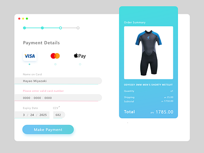
Daily UI :: 002 - Credit Card Payment
My first take on the Daily UI Challenge #2, Credit Card Payment. I Included an error prompt to complete the experience.
All elements on the payment section are aligned left to create uniformity, with the input boxes extending to the edges to emphasize them.
More by Kael Molo View profile
Like
