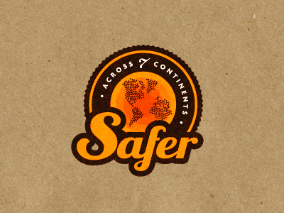
Safer Logo
For various reasons I will not go to much into detail, other than it's a product that has a global reach. This reach is to help people and to provide peace of mind. This logo is still very much at conceptual stage. The badge style of the logo is important to how the logo will be applied and marketed. Colours are not yet decided, although orange looks pretty vibrant and 'hey, look at me', it probably doesn't give of the 'calming' nature that Safer is meant to instill. The central portion represents the globe and I have created the continents out of individual dots, that represent people as this is very much people focused.
Hat tip to Dan C for the background, I remember him using it in a much earlier rebound project.
More by Smitho.graphics℠ — Logo & Icon Design Studio View profile
Like
